We come back to that thorny old question of "what should a cover look like/do?" For me I think it has to be eye-catching to some extent and not involve gun fights or super heroes battling it out with a villain.
If you look at Ben Dilworth two Dark Night Detective books then the covers say it all. Everything Is Under Control fits the dark and broody contents -think the TV cop series The Sweeney mixed with Soylent Green and Fahrenheit 451. Cover works.
Then we have Silvermaigne: Knight Ghoul Hunter cover (as with the previous one of my designs) a masked man with a sword with a background clearly showing its horror origins -and the twist at the end of the story actually took me by surprise as it was not what I was expecting. Second time Ben Dilworth has caught me out. Oddly this one got some very good comments regarding the cover design but no sales!
The original cover for the trade of the 6 part series from Black Tower Adventure (volume 2) was wrapped around the then 96pp story of Return of the Gods: Twilight of the Super Heroes and was basic and shows the central character Jack Flash floating through interstitial space with "The Many Eyed One" in the background. To me this is a weak cover but, it seems, peoiple like it but not enough to buy the book!
After nearly croaking it with a fourth bout of pneumonia I wanted to at least finish the story I had started in Black Tower Adventure vol. 1 about the Golden Age character the Bat and his wakening from a decades long sleep to find his country occupied and his attempts to win it back politically but failing that by force. Definitely an anti hero and how he dealt with the Blau Raben had one reader write to me: "What a cold blooded bastard!" Hey -no one wins in a war. I set the Bat standing amongst the rubble of buildings in his beloved Stahlia. To me The Bat Triumphant had a simple but effective cover.
Then we have another British Golden Age character -Krakos The Egyptian or "The Angel of the Burning Death" in Krakos: Sands of Terror! Definitely an anti-hero and in this he is attacked by Tuaregs, WW II 'shadow Messerschmitts'. there ai a cameo by The Many Eyed One I had forgotten about! And there is a confrontation with the gods of Egypt and his refusal to accept his "legacy".
No super heroes and the cover depicted a scene from the story and a total mistake I made I did not even notice. When I did I left it and the cover was up for an art award but the print on demand company idiotically deleted my online store and as the cover was not physically existing on a book -award went elsewhere. That's life.
With the reprint books I try to make the covers look bright and breezy and the cover for Come On Steve! was that -featuring old Roland Davies work and new Steve work by Ben Dilworth.
Hurricane Hurry also got the basic bright and breezy treatment. In case no one has heard or read me saying it before I hate trying to come up with cover art. Give me an image and I can design away...
A "stranger on a horse" -is a great line especially if you are/were into Spaghetti Westerns. When it comes to the fully re-lettered. redrawn and now 300+ pages version of Return of the Gods I drew up designs, drew cover art and the problem was what to choose?
The book involves an alien invasion following the appearance of black impenetrable domes over some Earth cities. A chinese scientist's brain inside a giant robot, heroes being transported to and endless plain where ancient gods inhabit Neo Olympus and are in fear of the return of the Ancient Old Gods and much more that encompassed action, sci fi, horror and so featuring one image might be misleading so I cam up with a cover that was designed to make you wonder what was inside and look...fail?

Withe the follow up to Return the cover was again simple and literally showed what the title said. Multiple Earths on the cover of The Cross Earths Caper -the trade of the strip from Adventure featuring super heroics, time travel, dinosaurrs and the first appearance of the mysterious man known as "Bob" (that mystery will be answered soon!
When it came to the final part of the Invasion Earth Trilogy I was stumped for a while. I wanted an eye-catching design again that did not require me drawing lots of characters on the cover and as with volume 1 and 2 (Return and Cross Earths) so much was involved. In fact, the page count was too high for a single volume so it had to be broken up into Volume III part 1, Volume III part 2 and Volume III part 3.
The Green Skies had many starts and stops as this time it was all me. Pencils, inks, paste ups, lettering and, well, the lot. Even selecting the chapter font took some considering.
The first cover showed the silhouette of the main character from Return -Jack Flash, the running man (yeah, I know). Once I finished that cover design I mulled over it a lot and thought it made4 sense and did look good. The second book featured the silhouette of The Shaman and so the more psychedelic background was in keeping with that character.
The third book was a silhouette of Varik Dann -the man who stepped through a door into
another world. The background worked well with his story.
The thing is that each of these characters had background stories that showed their part in "the final days of mankind". From Jack when he was a youngster and knew the outcome to the Shaman and his hippy-like magical beginnings (only hinted at mildly in Return. Varik, of course was the key to what was coming...or was he.
All of this was explained between the action and the stories of the battle between the Earth vampires lorded over by Varney the Vampire (last seen in the Rev. Merriwether book) and the parasitic, machiavellian vampire race the Vampirons (seen in Return) behind the Clone Zone Boys and preparing the way for The Many Eyed One. There is espionage, a space war to stop an alien invasion (and if that fails a doomsday device that will destroy the whole solar system ) and much more with characters from around the globe.
How do you put together a cover that sums that lot up??
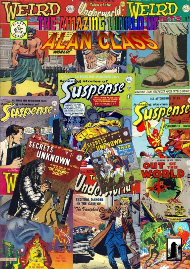
For something like The Amazing World of Alan Class which looked at the work of the legendary UK publisher it was easy. A cover full of Class Classic Comic covers! Bright, cheerful and leaving you in no doubt about what you were getting.
When it came to Dilworth's Aesop's Fables I thought the cover I came up with worked because it told you everything....Ben Dilworth's own take on some Aesop's fables,
With Dim Evening I was left with a quandary since this was an anthology but all 1990s material that after all of this time was still relevant. I thought "set it apart from the other books" and that this might also be more to the Small Press "community's" liking. Oh dear, again the "too high a quality" and so this gem is still awaiting discovery.
For sheer blow your retinas colour you cannot beat When Giants Fought: The Iron Warrior Vs Big Bong! and the laughs over "big bong" was worth the work. Ben Dilworth had fun with Rodney Dearth in The Iron Warrior exploring South America and discovering a lost city and its 'lord' -the already mentioned Big Bong. The art is by Ben Dilworth but the colour cover work was by (I am absolutely positive...I think) Brother Mike, Knowle Chapter.
When it comes to covers -you can see all of them at the online store or Black Tower Comic Shop News blog- I have found that whatever you plan (and without 10-20 cover variants and just as many cover artists) often what you end up with is completely different and based on a spur of the moment decision or even a mistake! Perhaps some more action to attract those who can only be attracted by those things?
With the exception of the first 96pp Return cover I don't think any of the 200 odd books have bad covers. I think it may well be down to what someone wrote; "You are producing unique books with unique covers so not the 'norm ' as it were" I'll go with that!
Black Tower Comic Shop News
Black Tower on Face Book


No comments:
Post a Comment