
There was some comment about why, with titles such as Return of the Gods: Twilight of the Super Heroes and The Cross Earths Caper, I never employed cover art featuring all out battle scenes.
Well, as Finland's comic creator, Pekka A. Manninen, put it -it isn't necessary. You design a cover to draw the eye of a potential customer in. That is a small part of getting said customer to buy. Now with Marvel, DC. IDW, Dark Horse and Image the idea of a battle, or at least a big scene involving the characters, on the cover is okay. But this is Independent comics.
You are not constrained by the limits of the larger company -it pays you to produce a cover that (as two editors have said to me over the years) "draws in the clunk-heads" (customer). Just as you can play around with page lay outs and more, the cover has to look good but have something to do with the interiors.
With any of the Black Tower titles there could have been a plethora of "action covers" but let's stand out from the crowd.
Chronos: The Watchman -the cover by Ben Dilworth shows our never-wanted-to-be hero struggling to push something back. But what? Buy the book, read the story and find out.
Cover ideas became quite pretentious. A faded cover that would signify the passing of the years (it was an anniversary book) or even to show the merging of Chaos' realm and Earth. In the end I slapped my hand very hard and said "Don't be such a stupid fecker!"

 Well, just add a tiny bit of colour...Nice but...no. It just never worked for me and if I can't be enthusiastic about the cover why should anyone else?
 A little more colour? This one worked for me so the 28th anniversary cover was sorted! I don't just
slap these things together you know!

There were a good few images thrown out but the above fitted in well. The same sort of thing happened with Krakos -I went through so many images and drew and re-drew until the final one clicked.
Krakos: Sands of Terror -that final cover got a lot of praise and when it first appeared in 2010 it was going to be listed for two art/design awards. I didn't see why but the people with a better eye did. The print on demand company screwed up and lost the files and even my online store! So, the awards people were sorry but they could not list a new book cover art...when the book was not available. It's a conspiracy.

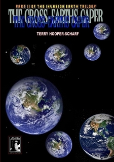
The Cross Earths Caper, because it involved the "multi-verse", got a cover featuring a multitude of spiralling Earths. Eye-catching. Or should be.
I cheated slightly and used a cover similar to that from the issue of Adventure in which the series started...

If you look at Return of the Gods the original, much shorter (by a couple hundred pages) "trade" had a number of covers such as this little embarrassment (which luckily never saw print!)...

And a few more images were tried then I gave up and settled on the final version.


Naturally, when the series was expanded from a trade to an original graphic novel it needed a new cover. One hinting at what the cover promised!

Okay, the quote camr from a very enthusiastic reviewer -but he swore that he stood by it.
And when Ben R. Dilworth decided to produce a three part modern day Purple Hood series he wanted to keep the covers simple. So Rule Britannia, Land of Hope, And Glory took a lot of thinking about but with purple as an inspiration....
Trying to get the covers right can be difficult. It is tempting to be over dramatic and use a fists and teeth flying cover. To conclude The Bat Triumphant story I opted for a very simple image.
 There were some back cover images never used. They were to promote The Bat versus Krakos -two Golden Age characters created by William A. Ward in a real scrap.

Brother Mike and I played about a little but when the time involved meant the comic would not appear it was all thrown into a folder.

Of course, "after the Green Skies" I said. "I'll do the team-up then". Of course, at the moment it might be possible that there will be no Earth ot BTCG universe after Green Skies.

Every-so-often it is nice to escape the art on Green Skies -currently around 500 pages and needing a few "bridging" pages before lettering.
I might make this the final cover....

Or, possibly, this one!

I have no idea. Maybe I'll put together another one. The point of all of this is simple really: think about the cover you are going to use and do not be afraid to throw one or more away!
Well, as Finland's comic creator, Pekka A. Manninen, put it -it isn't necessary. You design a cover to draw the eye of a potential customer in. That is a small part of getting said customer to buy. Now with Marvel, DC. IDW, Dark Horse and Image the idea of a battle, or at least a big scene involving the characters, on the cover is okay. But this is Independent comics.
You are not constrained by the limits of the larger company -it pays you to produce a cover that (as two editors have said to me over the years) "draws in the clunk-heads" (customer). Just as you can play around with page lay outs and more, the cover has to look good but have something to do with the interiors.
With any of the Black Tower titles there could have been a plethora of "action covers" but let's stand out from the crowd.
Chronos: The Watchman -the cover by Ben Dilworth shows our never-wanted-to-be hero struggling to push something back. But what? Buy the book, read the story and find out.
Cover ideas became quite pretentious. A faded cover that would signify the passing of the years (it was an anniversary book) or even to show the merging of Chaos' realm and Earth. In the end I slapped my hand very hard and said "Don't be such a stupid fecker!"
So I thought, just bold black and white to signify Black Tower's growth from the Small Press. Plain and simple. Then I realised that some -a very few- might think that sounded fine but most would simply say "Euw -it's just a black and white cover!"
slap these things together you know!
There were a good few images thrown out but the above fitted in well. The same sort of thing happened with Krakos -I went through so many images and drew and re-drew until the final one clicked.
Krakos: Sands of Terror -that final cover got a lot of praise and when it first appeared in 2010 it was going to be listed for two art/design awards. I didn't see why but the people with a better eye did. The print on demand company screwed up and lost the files and even my online store! So, the awards people were sorry but they could not list a new book cover art...when the book was not available. It's a conspiracy.
The Cross Earths Caper, because it involved the "multi-verse", got a cover featuring a multitude of spiralling Earths. Eye-catching. Or should be.
I cheated slightly and used a cover similar to that from the issue of Adventure in which the series started...
If you look at Return of the Gods the original, much shorter (by a couple hundred pages) "trade" had a number of covers such as this little embarrassment (which luckily never saw print!)...

And a few more images were tried then I gave up and settled on the final version.


Naturally, when the series was expanded from a trade to an original graphic novel it needed a new cover. One hinting at what the cover promised!
Okay, the quote camr from a very enthusiastic reviewer -but he swore that he stood by it.
And when Ben R. Dilworth decided to produce a three part modern day Purple Hood series he wanted to keep the covers simple. So Rule Britannia, Land of Hope, And Glory took a lot of thinking about but with purple as an inspiration....
Trying to get the covers right can be difficult. It is tempting to be over dramatic and use a fists and teeth flying cover. To conclude The Bat Triumphant story I opted for a very simple image.
Brother Mike and I played about a little but when the time involved meant the comic would not appear it was all thrown into a folder.
Of course, "after the Green Skies" I said. "I'll do the team-up then". Of course, at the moment it might be possible that there will be no Earth ot BTCG universe after Green Skies.
I might make this the final cover....
Or, possibly, this one!
I have no idea. Maybe I'll put together another one. The point of all of this is simple really: think about the cover you are going to use and do not be afraid to throw one or more away!
No comments:
Post a Comment